RE-BRAND PROJECT
I was tasked to create an entirely new brand for the product Garden Veggie Straws.
ORIGINAL PAIN POINTS
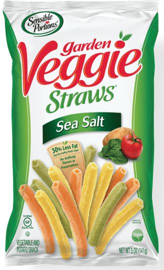
Package Impression:
- Cluttered
- Not very eye-catching
- Not very appealing for children
- Bags are consistent but lack a clear sense of style
Logo Impression:
- So much going on!
- Too much text
- Not very recognizable
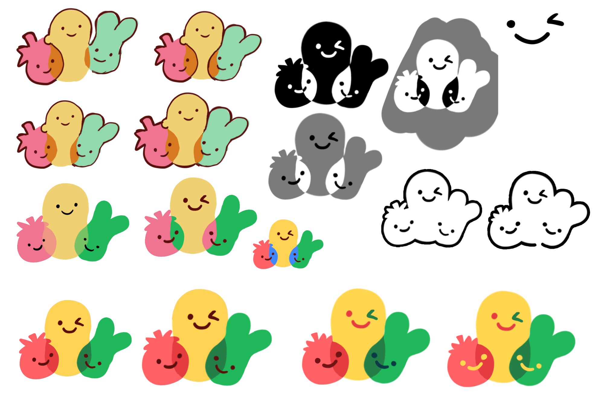
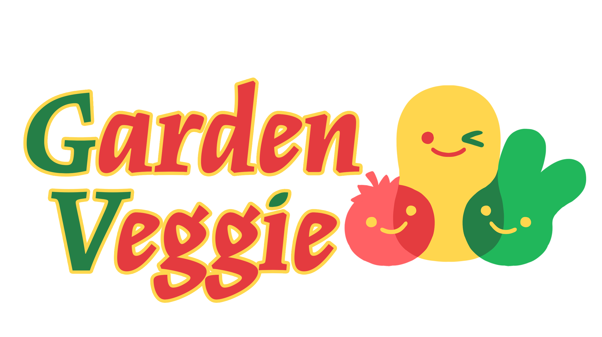
LOGO PROCESS
Tomato, Potato, and spinach...
Iconic flavors? Make it a cute, bright, mascot!


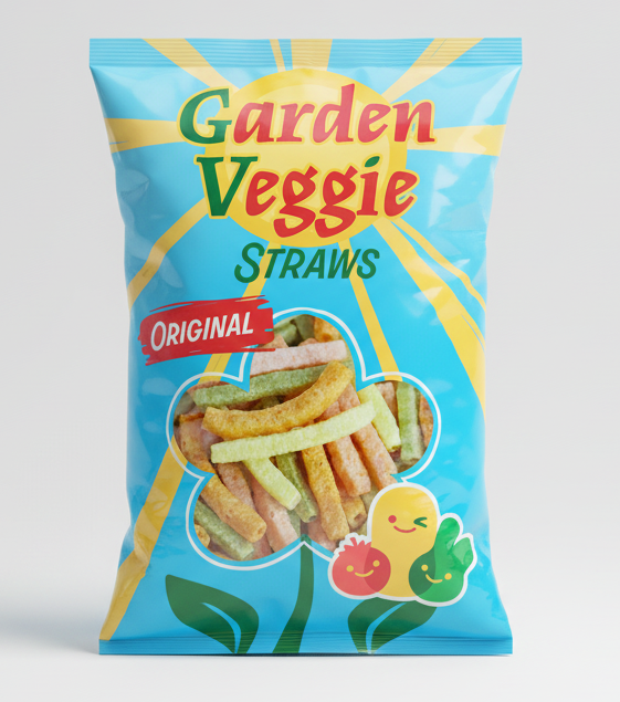
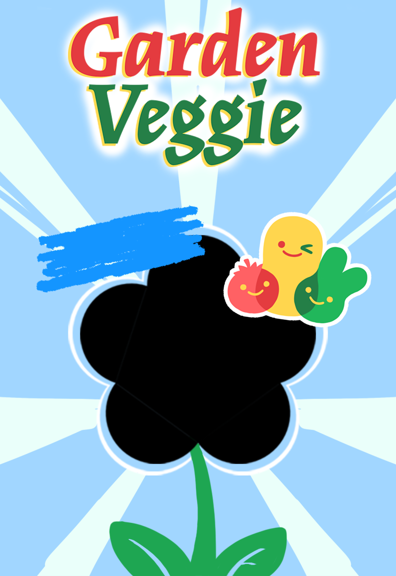
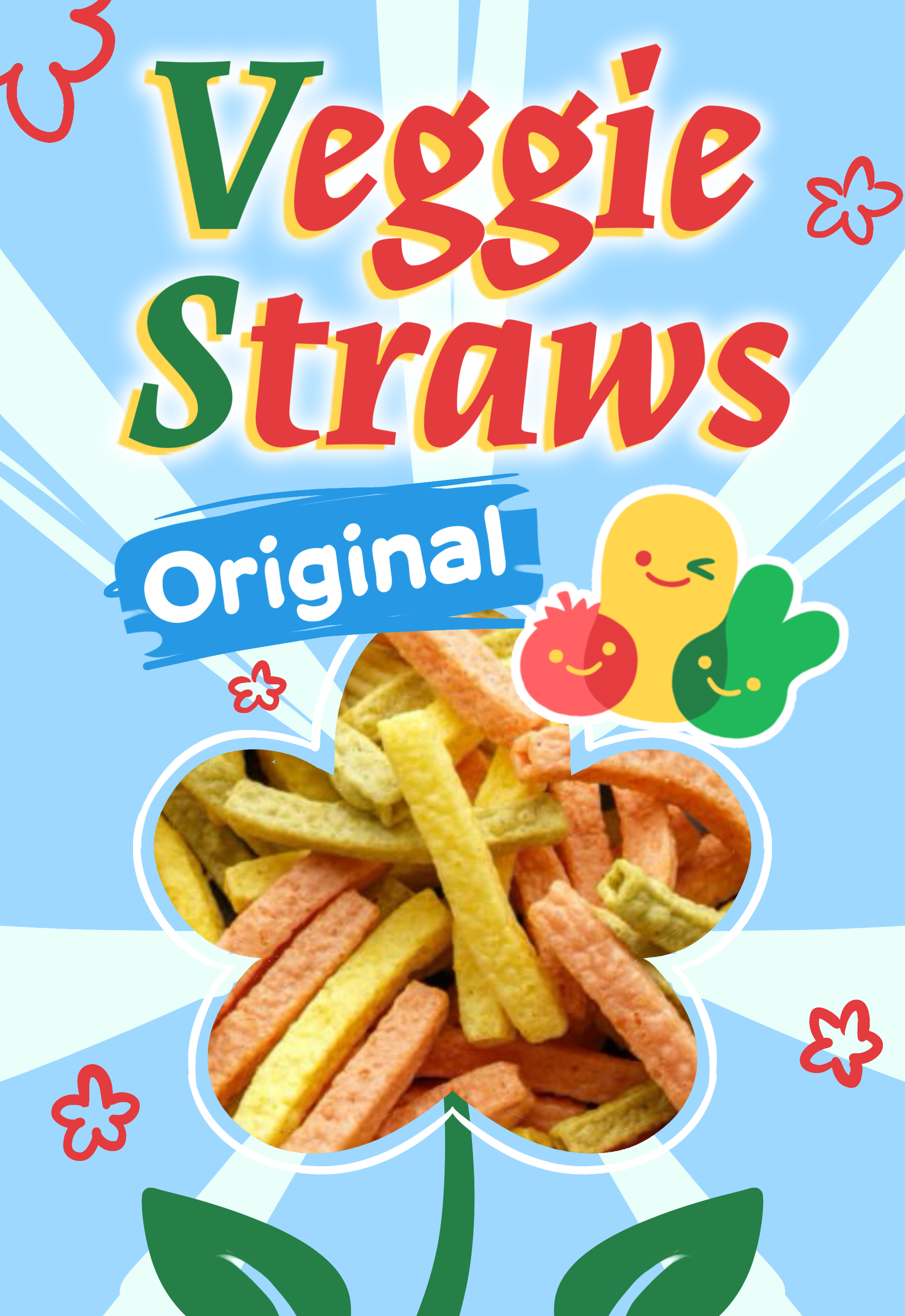
PACKAGE DESIGN PROCESS
The original design is cluttered and doesn't stand out. Lets fix that!
My process of development:
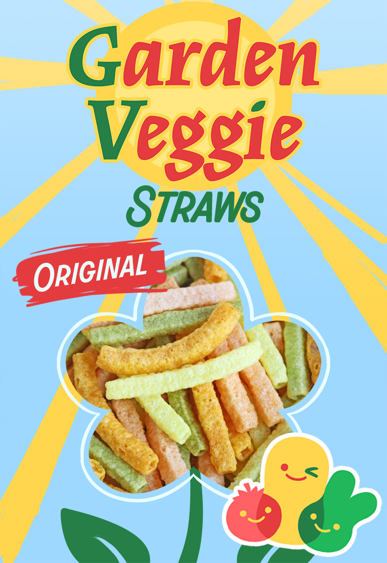
The final:
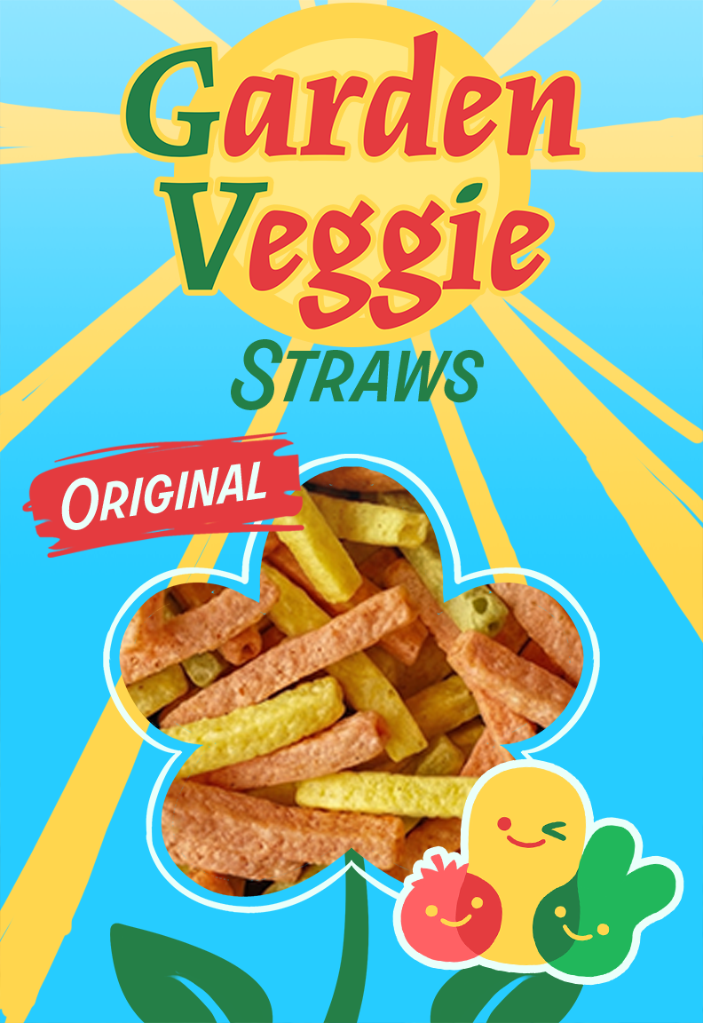
THE BIG IDEA
"SECRETLY HEALTHY"
While never explicitly saying it outright, Garden Veggie Straws implies that they are a healthier replacement to junk food.
This means the product must scratch that junk food itch, in other words it must still taste like junk food. The idea of "secretly" healthy is that this is a healthy snack that doesn't taste like a healthy snack.
SLOGAN
Snack better, live better.
BRAND STORY
Tricking your kid into eating healthy is a struggle for many parents. How can we encourage healthy habits in secret?
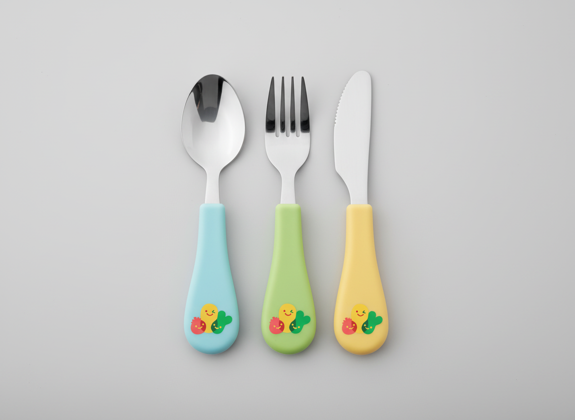
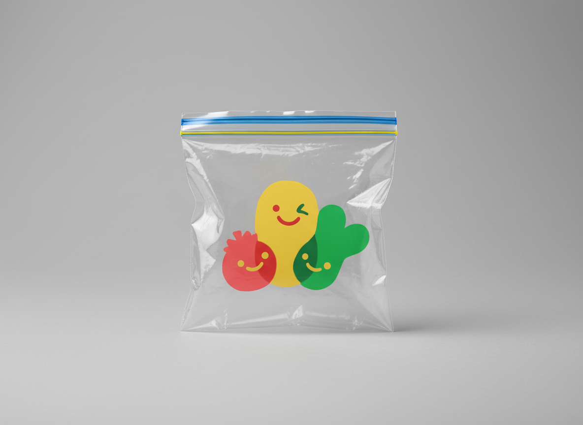
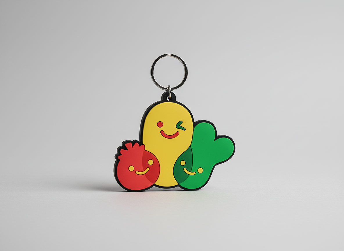
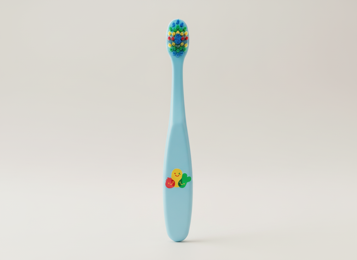
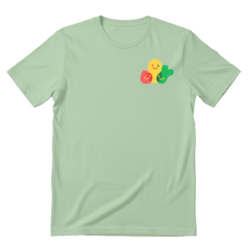
MOCK-UPS
Various mock-ups of potential merchandise and products with the updated designs, created by AI.